Your cart
There are no more items in your cart

- On sale!
- -30%
- New
In-Stock
White Moonstone
Natural White Moonstone 8-11mm Briolette Pear A Grade Gemstone Beads Strand
$7.00
$10.00
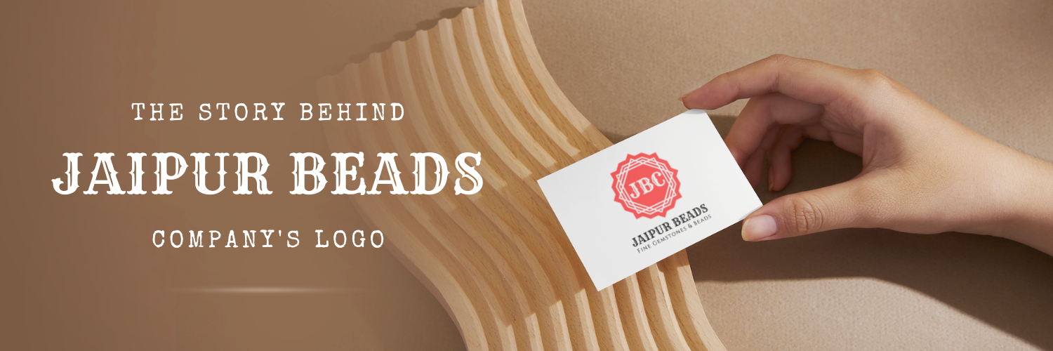
At Jaipur Beads, we take pride in our logo and the story behind it. It serves as a reminder of the hard work, dedication, and passion that has gone into making our business a success. The design of our logo encapsulates the values that have come to define us and is a representation of our commitment to our customers. In this blog post, we'll delve into the inspiration behind our logo and the reasons why it has become such an important part of our identity.
ABOUT JAIPUR BEADS COMPANY
Jaipur Beads Company is a leading manufacturer and supplier of premium quality gemstones and gemstone beads, based in Jaipur City, India. We specialize in creating stunning, handcrafted beads and gems that are designed to meet the needs of our clients around the world. We take great pride in our rich cultural heritage, which is reflected in our designs and the quality of our products. As a company, we are dedicated to promoting traditional Indian art forms, while also innovating and evolving with the changing times. Our logo design is inspired by the rich history and culture of Jaipur City, and we are proud to incorporate these elements into our brand identity.
CHOOSE A SHAPE AND COLOR OF LOGO RELATED TO JAIPUR CITY
Choosing the perfect shape and color for a company logo can be daunting, but it becomes much easier when the inspiration comes from a place as vibrant as Jaipur City. At our Company, we wanted our logo to represent the city's culture and heritage, so we went through an exciting journey of choosing the right elements.
We start creating our logo with a circle, and after adding 2 squares & 1 octagonal shape, we found the actual shape of our logo. This is symbolizing the unity and completeness that the city represents.
For the colors, we took inspiration from the famous pink walls that are an integral part of Jaipur's architecture and opted for a beautiful pink hue that evokes a sense of charm and warmth.
The process of choosing the shape and color of our logo was not just about aesthetics; we also wanted our brand identity to connect with the people of Jaipur on a deeper level. We are thrilled with the outcome and are proud to say that our logo truly represents Jaipur Beads Company's vision and mission.
CHOOSE ELEMENTS TO DESIGN OUR LOGO RELATED TO JAIPUR BUILDINGS
When designing our logo, we wanted to incorporate elements unique to Jaipur's architecture and buildings. The city of Jaipur is known for its stunning structures, including the iconic Hawa Mahal and Amer Fort. To represent these architectural marvels, we chose to incorporate elements such as arches, domes, and intricate detailing into our logo design.
Using clean and simple white lines, we were able to capture the essence of these buildings in a minimalistic yet impactful way. The white lines not only add a touch of elegance but also symbolize the intricate carvings and delicate craftsmanship seen in Jaipur's architecture.
By selecting elements that are closely related to Jaipur's buildings, we are creating a logo that truly embodies the essence of the city. This ensures that our brand image is rooted in the rich cultural heritage and architectural splendor that Jaipur is known for.
CHOOSE FONTS RELATED TO JAIPUR HERITAGE
When designing a logo, the font is just as important as the shape and color. For our company's logo, we wanted to choose fonts that would represent the heritage and culture of Jaipur. To represent this heritage in our logo, we choose the “RYE” font, which was genuinely related to Jaipur's culture. We found this font in Canva (a design tool) after many struggles. Overall, the fonts in our logo reflect the perfect blend of old-world charm and modern sensibilities that define our company and our products.
THE WHOLE LOGO IS RELATED TO JAIPUR

When designing our company logo, we wanted it to be a true representation of Jaipur and all that it stands for. Every element of our logo is carefully chosen to reflect the rich heritage and cultural significance of this beautiful city.
From the shape and color to the intricate details, our logo incorporates iconic elements of Jaipur. The vibrant colors, reminiscent of the city's famous festivals, capture the essence of the vibrant culture that permeates every corner of Jaipur.
The logo also features architectural elements inspired by the stunning buildings and landmarks that Jaipur is known for. The intricate designs and motifs pay homage to the exquisite craftsmanship that the city is renowned for.
Incorporating fonts that evoke the regal charm and grandeur of Jaipur's heritage, our logo is a perfect blend of traditional and modern aesthetics. It embodies the spirit of Jaipur and everything it represents – a city steeped in history and yet bustling with life.
By designing a logo that is so deeply connected to Jaipur, we aim to convey our company's commitment to honoring and preserving the rich cultural heritage of this magnificent city. Our logo serves as a constant reminder of our roots and the values that we hold dear.
IMPLEMENTING THE LOGO IN OUR BRANDING
Once we had finalized our inspiring company logo, the next step was to implement it in our branding strategy. We wanted our logo to be prominently displayed across all our marketing materials and digital platforms. From our website to social media profiles, our logo became the face of our brand. We also made sure to include it on our business cards, letterheads, and product packaging to create a cohesive brand identity. Additionally, we incorporated elements from our logo into our marketing campaigns, such as using the logo colors in our advertisements and incorporating the logo shape in our promotional materials. The logo became a visual representation of our brand and helped us create a strong and recognizable presence in the market.


If you're in the market for gemstone beads, buying online can be a convenient and cost-effective option. With the vast selection of gemstone beads available from various online retailers, it can be overwhelming to navigate through all the choices. That's why we've put together this guide to help you make informed decisions when buying gemstone beads online. Whether you're a beginner or an experienced jewelry maker, this guide will provide you with valuable tips and insights to ensure a successful purchase. From knowing what to look for in terms of quality and authenticity to understanding the different types of gemstones, we've got you covered. So, let's dive in and discover the world of buying gemstone beads online.
Read more
Jaipur, also known as the "Pink City," is a city famous for its rich history, culture, and heritage. But did you know that it is also a haven for gemstone enthusiasts? Jaipur is known as the gemstone capital of India, with a plethora of markets offering an array of stunning gemstones and jewelry. However, if you are specifically looking for high-quality and authentic gemstone beads, there is one market that stands out among the rest. In this blog post, we will explore the famous gemstone beads market in Jaipur and why it is a must-visit for anyone interested in gemstones. So, let's dive into the world of sparkling gemstone beads in Jaipur!
Read more
Hey there gemstone lovers! Have you ever wondered how many beads are in a strand? Well, the answer might surprise you. It all depends on the size of the beads and the length of the strand. In this blog post, we'll dive into the fascinating world of gemstone bead strands and explore the various factors that determine the number of beads in a strand. So grab your favorite gemstone jewelry and get ready to learn something new!
Read more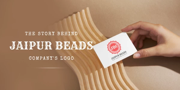
At our company, we take pride in our logo and the story behind it. It serves as a reminder of the hard work, dedication, and passion that has gone into making our business a success. The design of our logo encapsulates the values that have come to define us and is a representation of our commitment to our customers. In this blog post, we'll delve into the inspiration behind our logo and the reasons why it has become such an important part of our identity.
Read more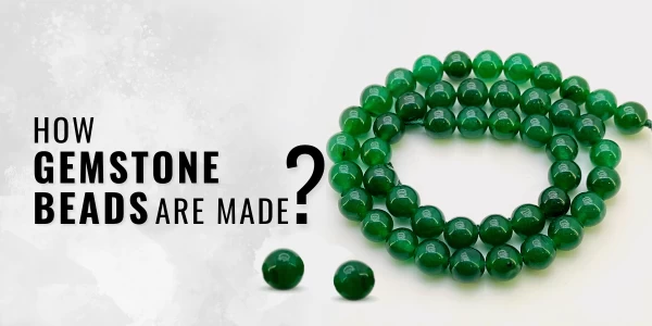
Gemstone beads have been around for thousands of years, and while the process may have changed over the years, the beauty of gemstones remains timeless. Have you ever wondered how these mesmerizingly beautiful beads are made? In this blog post, we will take a look at the process of making gemstone beads, from mining and cutting to drilling and polishing. Read on to learn more about the fascinating process behind creating gemstone beads!
Read more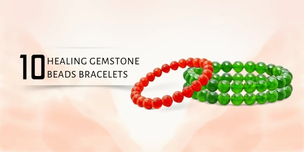
Gemstones have been used for centuries to heal and protect the body, mind, and spirit. They are believed to be powerful tools that can help bring balance and harmony to the wearer. With so many types of healing gemstones, it can be hard to decide which bracelet is best for you. To make your decision a bit easier, we’ve rounded up the top 10 healing gemstone bracelets to help you find the perfect one for your needs. Whether you’re looking for protection, clarity, or simply a beautiful accessory, these bracelets will give you the healing power you need.
Read more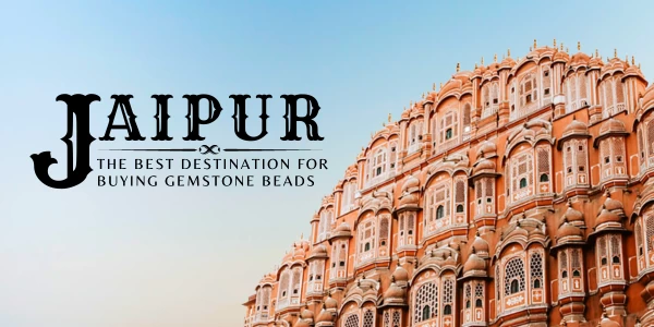
Jaipur, India is known as the Gemstone City, and for good reason. With its centuries-old history of being a hub for jewelry and gemstones, Jaipur has become a top destination for those looking to buy gemstone beads. Not only does Jaipur offer a wide range of options, but it also has a reputation for producing some of the highest-quality gemstones in the world. Whether you’re a novice or a connoisseur, Jaipur is an ideal destination for purchasing gemstone beads. In this blog post, we discuss why Jaipur is the best destination for buying gemstone beads.
Read more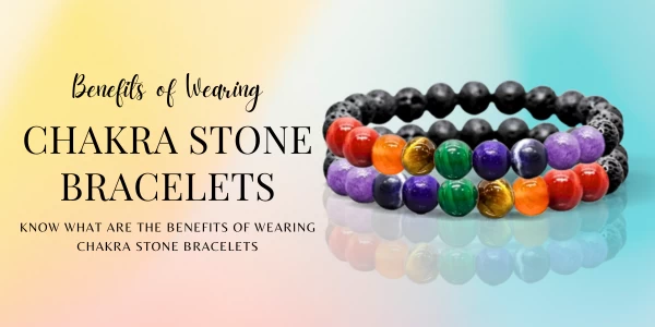
Chakra stone bracelets are an ancient form of jewelry that is still popular today. Not only do they add a unique and beautiful touch to any outfit, but they also carry with them several potential benefits. Wearing a chakra stone bracelet is said to help align and balance the seven energy centers of the body, resulting in physical, emotional, and mental well-being. In this blog post, we'll explore the potential benefits of wearing chakra stone bracelets, and how you can make the most out of these special pieces of jewelry.
Read more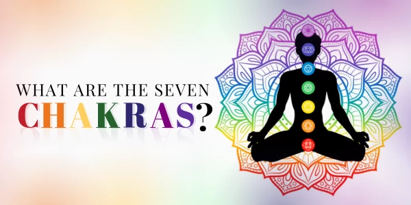
Have you ever heard of chakra stones? These colorful gems are believed to have healing properties that align with the body's seven chakras. Each chakra corresponds to a specific color and is associated with different physical and emotional characteristics. Chakra stones can be used in meditation, energy healing, and worn as jewelry. In this blog post, we'll explore what are the actual chakra stones and their meanings.
Read more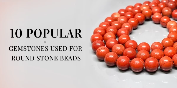
Round gemstone beads are a great way to add color and personality to your jewelry designs. Whether you're creating a unique necklace, bracelet, or earrings, choosing the right type of stone can make a big difference in the look and feel of your project. To help you decide which stones to use, we've compiled a list of the 10 most popular stones used for round gemstone beads. From vibrant options like amethyst and jasper to more classic like tiger eye and agate, you'll find something that suits your style!
Read more
Comments (0)